Android might be getting a fresh new look soon. According to recent leaks, the next version could lean into a frosted, see-through design that feels a lot like what Apple’s been doing with iOS (translucent).
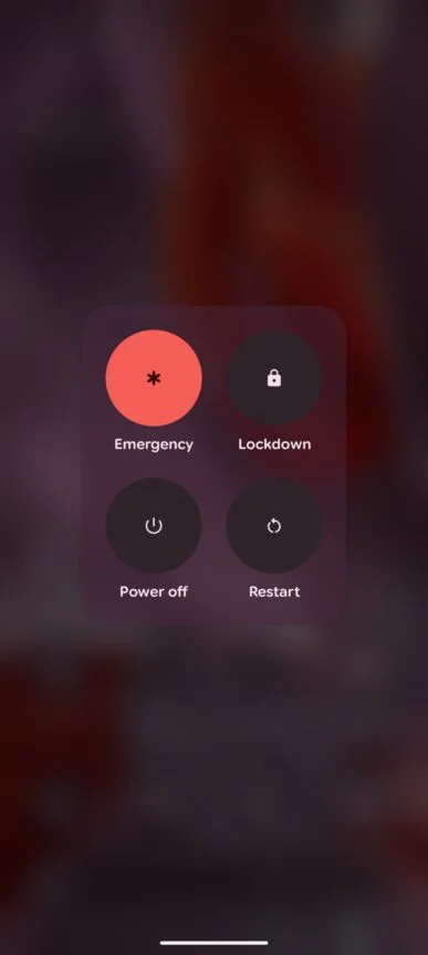
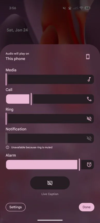
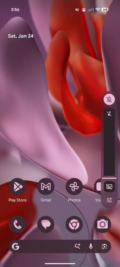
Early leaks indicate that Android 17, codenamed Android V, will shift away from solid-color design elements. Screenshots shared by MysticLeaks on Telegram point to the use of background blur across much of the interface, similar to Apple’s “Liquid Glass” design introduced with iOS 26.
From the leaks, it looks like Google is playing it safer. iOS 26 goes all in on the glossy, glassy effect, while Android 17 seems to apply translucency with a lighter touch, even if it’s still a big change for the platform.


With Android 16, blur was used in a small part, mainly in the notification shade and app drawer, while most of the interface stuck to solid colors pulled from the wallpaper. The leaks now point to Android 17 going much further, swapping those solid panels for a frosted look across the system, including the power menu and volume slider.
In addition to the new blur effects, the leaks highlight other updates. Audio and microphone recording controls are shown in a floating, pill-shaped interface instead of the existing pop-up dialog, and the screen recording feature reportedly adds tools for doodling and previewing clips prior to sharing.
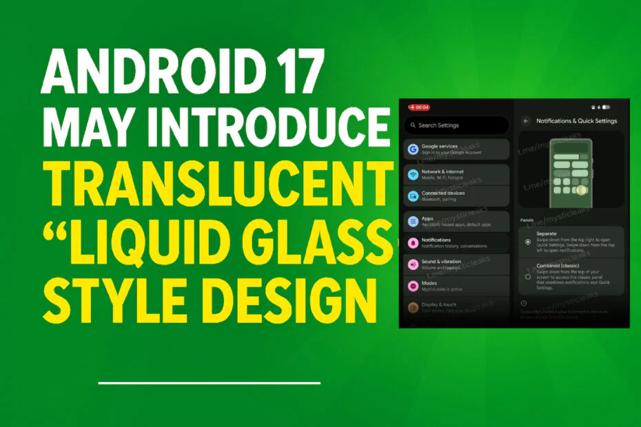
There’s also what looks like another iOS-style tweak: notifications and Quick Settings may no longer live together, instead being split into their own sections.
Even with all the visual changes, Android 17 doesn’t seem like a huge shake-up under the hood, with most of its core features working much the same as they did in Android 16.
Since its debut, Apple’s Liquid Glass UI has drawn mixed reactions. While some users appreciate its modern, layered appearance and compare it to Windows 7’s Aero glass, others argue the effects may increase visual strain, GPU usage, and potentially affect performance or battery efficiency.
The leak raises questions about how Google will differentiate the design and optimize performance. If implemented successfully, the translucent look could bring a more refined and cohesive feel to Android, even if it draws clear comparisons to its main competitor. Official details are expected later this year as Google prepares for the next Android beta cycle.
Maybe you would like other interesting articles?

